I was going back and forth with a friend about what NBA jerseys were great and which ones were awful. It sparked a huge interest with us and it should with fans around the globe. Jerseys are worn on a nightly basis and it is important that people have something nice to look at that is not too distracting. That leads me to a list of top 5 most critiqued jerseys in NBA history.
5. Memphis Grizzlies Alternate 2013
 |
| Noah Graham/NBAE |
4. Los Angeles Clippers Alternate 2013
Another team, another ABA throwback fail. In 2013 the NBA was celebrating the 45th anniversary of the American Basketball Association. That is why the Grizzlies and Clippers both have ABA throwback jerseys in the same year. The best part is that they played each other wearing these abominations. The Clippers jersey is a throwback representing the ABA team Los Angeles Stars. This jersey is not as bad as the Memphis ones because they actually match and have a nice color scheme. The major problem with this jersey though is the font on the front. For those who couldn't tell that says "Los Angeles". The problem is it looks like a fifth grader spelled Los Angeles and forgot to include the letters "o" and "e". And as any kid would do to fix this, he or she would go back and squeeze the letters in. It looks really bad and for that reason it made this list.
3. Philadelphia Home and Away Jerseys 1991-94
 |
| Nathaniel S. Butler/NBAE |
2. Washington Wizards Gold and Black Alternate
 |
| Gregory Shamus/Getty Images |
Personally this is one of my favorite jerseys of all time. I really like the gold and black, but that is a very unpopular opinion. Most fans think this is the ugliest uniform ever made and it is easy to understand why. When a uniforms shorts don't match the jersey itself it usually comes under fire. That was the case with number 5 on this list and the same thing happened here. Another problem with this jersey is it has nothing to do with the wizards color scheme. The color scheme for the franchise has always been red, white, and blue. But this was during the time in which the Wizards main colors were blue, bronze and black. The Bullets changing their name to the Wizards is a whole debacle itself, but nevertheless these jerseys were a product. It is unknown why the Wizards made these jerseys because they have nothing to do with their color scheme past or present. They were just made to look cool and they dropped the ball when it comes to the general public's opinion of these jerseys.
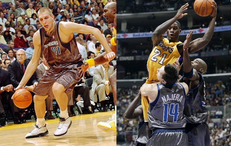
1. Dallas Mavericks Black/Silver Alternate
Just take a second and soak these bad boys in. These are the most hideous jerseys I've ever seen and I did not even know they existed until I did this article. They look like a space suit or a trash bag. If you have ever seen Better Call Saul you know his brother has a space blanket to protect himself from electric radiation. If you took that blanket and made it a jersey this is the result. The jokes for these jerseys are never ending and that is why they made the top spot on this list.


No comments:
Post a Comment